The Idea
Create a reading application that blends an ebook with a streaming service and social media feed. Make it immersive and accessible to many readers.
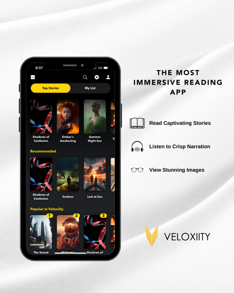
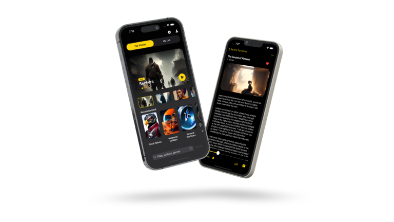
Veloxiity was inspired by the seamless interfaces of Netflix, Amazon Kindle, and Instagram, but with a distinct goal—to remove social distractions and fully immerse readers in storytelling. My vision was to reimagine digital reading by framing each story as a cinematic experience, much like a film, show, or social media post, setting the expectation of entertainment from the very first glance. The addition of story trailers further amplified this cinematic effect, enticing readers the way a movie preview would, making literature feel more dynamic and visually engaging.
To deepen immersion, I designed Veloxiity with a multi-layered reading structure. Readers would engage with stories in a way that felt progressively deeper—much like navigating through an interactive narrative. Even a short story of under 3,000 words could evoke the richness and depth of a high-budget film, ensuring that brief reading experiences felt just as impactful as feature-length productions.
Beyond storytelling itself, the reading environment was a critical component. Veloxiity allows for a customizable sensory experience, integrating images, music, and narration in various configurations to suit individual preferences. This approach transforms reading into an adaptive, almost streaming-like experience, where stories unfold not just through words, but through an orchestrated blend of media. By leveraging the familiarity of social media interfaces and the engagement of streaming platforms, Veloxiity makes storytelling more accessible, immersive, and visually compelling.
Visual Branding
Typography
Century Gothic Regular is the primary font, known for its clean, geometric style. This choice aligns with a futuristic and high-tech aesthetic, reinforcing Veloxiity’s digital and immersive storytelling experience.
Color Palette
Primary Gold (fbb03b & f5cf5b): This gold gradient represents sophistication, prestige, and a cinematic feel, tying into the app’s theme of premium storytelling.
Black & White (#121212 & #ffffff): The high contrast between deep black and bright white enhances readability and creates a bold, modern interface that feels sleek and immersive.
Additional Colors & Their Purpose
Achievements (d4446d & e36ae4 – Red/Purple): These colors evoke excitement and prestige, likely used to highlight accomplishments, milestones, or rewards in the platform.
Information (59a9e1 & 7fd3e4 – Blue Shades): Cool and calming, these colors are typically associated with clarity, making them ideal for informational elements or UI components.
Premium (74e253 & 8bf0b9 – Green Shades): Green conveys exclusivity and value, likely indicating premium content or subscription-based features.
Design Language & Shapes
The rounded, gradient-filled shapes suggest a smooth, modern, and user-friendly interface. The curved bottom edgewithin the pink gradient section hints at dynamic, fluid storytelling elements, reinforcing the interactive nature of Veloxiity.
Overall Feel
This branding conveys a cinematic, modern, and high-end reading experience, merging elements of entertainment streaming platforms with a clean, distraction-free reading environment. The use of gradients and bold contrasts makes it visually engaging while maintaining a futuristic and premium feel.
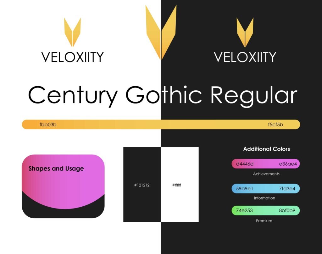
Logo Design
The Veloxiity logo cleverly merges the tip of a fountain pen, the pages of an open book, and the letter “V”, symbolizing the fusion of storytelling, creativity, and a premium reading experience.


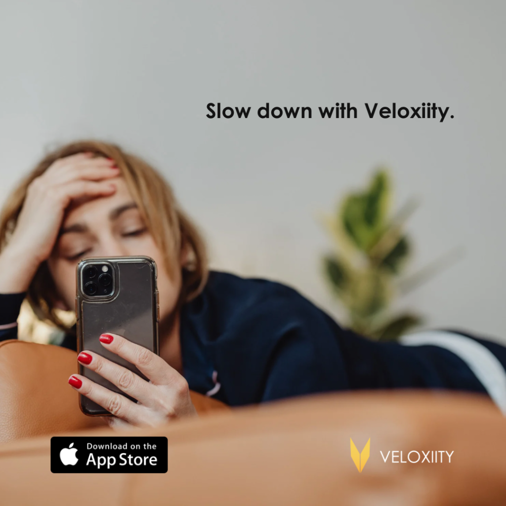
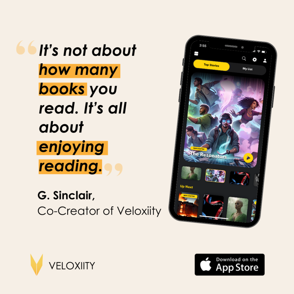
Social Media and Advertisement